
Kseniia Daniels
Art Director with passion for Accessibility

Visiting Neighbors App
Design Sprint
Visiting Neighbors helps seniors in NYC live active and meaningful lives by matching them with one of the dedicated volunteers.
Challenge: Identify an interactive way to make seniors’ walks more engaging while giving an option for recording the conversation at any point.
Solution: Create an application that stimulates the conversation and generates diverse walks based on seniors’ needs.
Timeline: 3 weeks
Deliverables: App prototype
Team: Ami Mehta, Beryl Liu, Lauren Busser, Jack Issler
Role: UX Designer
Tools: Figma, Miro board
Responsibilities: Prototyping, research
Kickoff meeting
“If you bring anything to the table that involves technology, I know our volunteers and I will be over the moon”
Overview
-
"Visiting volunteers" is really the only lifeline to the outside world for the seniors.
-
Volunteers likely have a phone that they can use to record and walk at the same time.
-
Put together a series of walking tours in which we can identify interesting landmarks.
-
Stimulate the dialogue and a narrative to collect the seniors' stories for the organization's Oral History Project.
Personas
During the kickoff meeting, we were told that seniors could be roughly divided into 3 groups. Although the volunteers could also be included in the target users, we decided to focus mainly on the end-users, the seniors.


Persona 1, Joan, 64: Joan is a dog owner and a grandparent who lives in an apartment in Chelsea in Manhattan. They like talking to people about various topics, especially social issues, but struggle to begin the conversation. Joan is easy-going and easily shares jokes about life-based events. They enjoy walking, but can’t walk more than 3 blocks without taking a break. Joan isn’t sure how they feel about being called a ‘senior’ and prefers to avoid talking about this.
Persona 2, William, 77: William lives with their partner in Greenwich Village in Manhattan. He likes meeting new people and debating controversial topics. He wants to improve their cooking skills but struggles to find the classes nearby. William enjoys long walks as long as they are slow-paced. William prefers taking coffee breaks during the walk and enjoys reading books outside. William is open about his problems and admits that he’s a bit sensitive, but doesn’t mind being called a ‘senior’.
Persona 3, Sonya, 89: Sonya is a former history teacher who lives with her sister in Stuyvesant Town in Manhattan. Sonya uses every opportunity to go outside, as it keeps her connected with the world. It’s difficult for her to talk and walk at the same time, so she prefers to keep silent while walking. She needs frequent breaks and struggles with going for more than several blocks. During the break, Sonya is quick to share witty jokes and historical facts. She also enjoys meditation as her new hobby and wants to learn more.
Key questions
How can we get seniors and volunteers to connect?
How can we create an alternative to friendly visiting?
How can we integrate audio recording during the walk?
Process
Ideation
As a team, we first started by choosing the platform that can be easily accessed throughout the walks. Our choice was smartphones since the majority of volunteers have access to them. Then we decided to prototype a mobile application that can be used by volunteers and PDFs of walking tours to print for the seniors for their convenience. I was responsible for the prototype, while the rest of the team designed the PDFs, and presentation and researched the information.
Feature prioritization
Next, we brainstormed content ideas that may be included in the app by using the Miro board. Because there were a lot of them, we grouped them together by priority. We also included the themes that must be avoided in the app.

User flow diagram
When I realized how many features we wanted to include, I created a user flow chart using the Miro board to make future prototyping easier. The chart visualized the user experience through the app and the range of options each screen would have.

Style guide
-
Illustrations represent diverse people
-
Same colors & logo as the organization uses
-
Traditional and clear fonts for the body text
-
Friendly looking font for the title

Prototyping
Low-fidelity prototype
I produced clickable wireframes in Figma as a lo-fi prototype, as I knew we had limited time. Creating wireframes in Figma allowed me to move to the high-fi prototype quickly. It was also fairly easy to change the layouts once I received feedback from the team.
Iterations
There are several examples of iterations I made throughout the process below. Look at the Figma board.

-
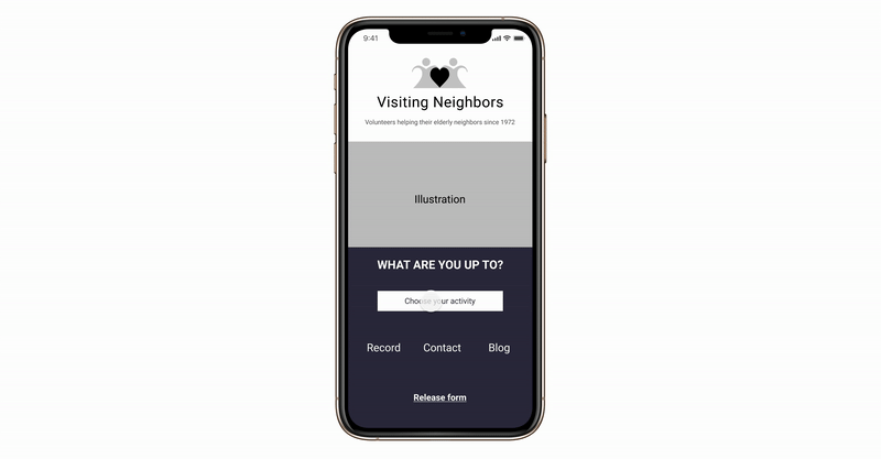
Tagline and the activity button: The logo and name could have different interpretations for users. That’s why I added a tagline to make it clear. The button ‘Choose your activity’ leads to the key features of the app. So I made this button more attractive to tap, by using relative non-intrusive graphics.
-
Home button and default options on the map: At first, I used a sandwich menu icon and then realized that it usually leads to a slide-in side menu. For the purpose of jumping back to the homepage, I changed it to the ‘home’ icon. The map looked like it lacks interactivity and its purpose isn’t clear at the first glance, so I added options that show up by default.
-
Misleading illustration of the classes tab: I used an illustration of the calendar to represent ‘classes’ which suggests a calendar of classes, not the classes that happen around. Hence, I used a less misleading image of cooking to represent the classes users will see in this category.
-
Misleading wording: I used the confusing wording ‘try again’ which usually appears when the system can't load the content (e.g. no wi-fi). So instead I changed the wording to ‘Another spot?’.

The logo and name could have different interpretations for users. That’s why I added a tagline to make it clear. The button ‘Choose your activity’ leads to the key features of the app. So I made this button more attractive to tap, by using relative non-intrusive graphics.

At first, I used a sandwich menu icon and then realized that it usually leads to a slide-in side menu. For the purpose of jumping back to the homepage, I changed it to the ‘home’ icon. The map looked like it lacks interactivity and its purpose isn’t clear from the first glance, so I added options that show up by default.

I used the confusing wording ‘try again’ which usually appears when the system can't load the content (e.g. no wi-fi). So instead I changed the wording to ‘Another spot?’.
The logo and name could have different interpretations for users. That’s why I added a tagline to make it clear. The button ‘Choose your activity’ leads to the key features of the app. So I made this button more attractive to tap, by using relative non-intrusive graphics.
High-fidelity prototype
"I love how you used our colors and I know our volunteers will be really excited to use it!"
It took me almost a week to build a final prototype. Unfortunately, we didn't test it with users due to the time frame and remote collaboration. However, we presented it to Visiting Neighbors and were pleasantly surprised with their feedback. They especially liked the release form for the volunteers, the contact form for the seniors, and the consent form for the recording. The prototype also included all the features the organization mentioned during our kickoff meeting. Features included conversation stimulation, recording on the go, and generating walks based on the senior's needs.
Takeaways
What went well
-
The clients liked the prototype and since the goal was to come up with an idea rather than the final product, the project ended successfully.
-
The UI of the app prototype aligned with the organization's brand and conveyed a friendly feeling.
Future goals
-
I would conduct user interviews of both seniors and volunteers before building anything. Although the clients gave enough information for ideation, I felt that it wasn't enough to create something to satisfy users' needs and simultaneously avoid their pain points. Thus, I would still want to conduct foundational research and interview potential users to see if the app idea could solve some of their problems.
-
I would definitely test the lo-fi prototype with the users before moving on to the final one if I had more time and resources. This would prevent potential mistakes in the design.
-
Right now I don't have any information on the usability of the prototype. Hence, the project would greatly benefit from usability testing.
-
I also need to develop the prototype more, for instance, include different scenarios for the survey to show different walks.